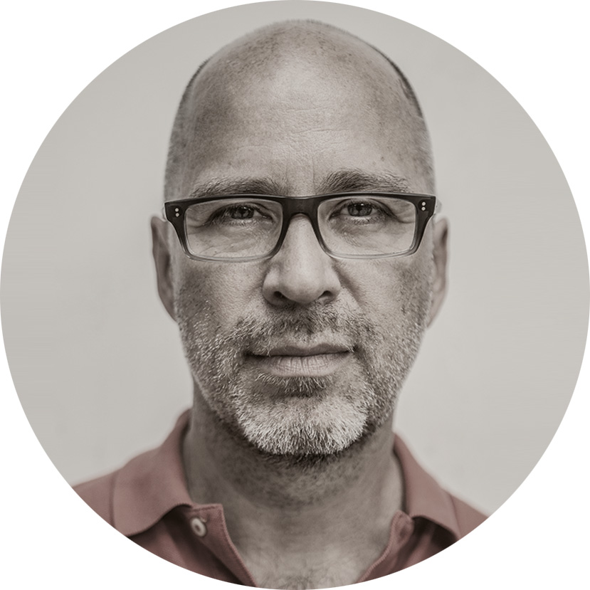
About the author
I’m an independent journalist, travel writer and author who’s lived in Central Europe for nearly three decades. I love the history, literature, culture and mystery of this often-overlooked corner of Europe, and I make my living writing articles and guidebooks about the region. Much of what I write eventually finds its way into commercial print or digital outlets, but a lot of it does not.
And that’s my aim with this website: to find a space for stories and experiences that fall outside the publishing mainstream.
My Book: ‘Čas Proměn’
In 2021, I published “Čas Proměn” (“Time of Changes”), my first book of historical nonfiction. The book, written in Czech, is a collection of stories about Central and Eastern Europe in the 1980s and early ‘90s, including memories of the thrilling anti-communist revolutions of 1989. The idea for the book and many of the tales I tell there were directly inspired by this blog. Czech readers, find a link to purchase the book here. I hope you enjoy.